
Is the Covid19 data hacked?
The Covid19 infection and death figures are quite unsettling. Major policy decisions are being taken on the basis of available data and the subsequent projections. But the fundamental question is – is this data reliable? Or is it hacked?
There are lot of conspiracy theories doing rounds. Some say it’s a world war in full swing, while others believe it is the collective efforts of various governments to enforce various citizen control mechanisms. Some blame it on the 5G network while others claim that a false reality has been created through a mind game. Most believers are pretty convinced about their respective stands.
The Covid19 mortality rate projections and the associated uncertainties have created so much of scare that infection is perceived as a possible death warrant. Such scare not only decreases immunity but also incubates extreme viewpoints. No wonder some people are overwhelmingly cautious while others are trying to tell themselves that there is nothing wrong with the world. It is still OK if ordinary citizens are clueless, but a clueless medical community and government machinery is indeed worrisome. In such a chaotic scenario, it is obvious that people will cast doubt on various policy decisions, especially when they bring miseries and deaths.

I wonder if this chaos can be attributed to something like p-hacking, also known as data dredging. P-hacking means misuse of data analysis to present something as statistically significant while it is not. P-value represents the Probability Value regarding hypotheses. In the current scenario, I hope it has not mutated to represent some sort of Political Value.
Inaccurate tabulation of Covid19 deaths
A question has been asked again and again is – are people dying due to Covid19 or dying with Covid19? The difference between the two is pretty significant. The entire landscape changes based on the lens used to view the ‘pandemic’.
It is pretty safe to assume that the number of deaths for a certain month remains more or less similar to the number deaths for the same month in corresponding year. This means that the number of death in a city or state for the month of April 2020 will not be significantly differently from the figures of April 2019. Hence, to tabulate the actual Covid19 deaths, it may be a good idea to compare these figures. It would be better to consider the difference as Covid19 deaths, rather than considering the death of every Corona positive person as a Covid19 casualty, especially when the infection is pretty contagious.
The only possible variation in such data is accidental deaths, which could be significantly different due to lockdowns and low mobility. To bring in more precision, the data can be made more granular.
| Year | Description | May | June |
| 2019 | Total deaths | a1 | b1 |
| 2019 | Accidental deaths | a2 | b2 |
| 2019 | Non accidental deaths | a3=(a1-a2) | b3=(b1-b2) |
| 2020 | Total deaths | x1 | y1 |
| 2020 | Accidental deaths | x2 | y2 |
| 2020 | Non accidental deaths | x3 =(x1-x2) | y3 =(y1-y2) |
| COVID19 DEATHS | x3-a3 | y3-b3 |
To illustrate, let us assume that in a certain location, 5000 people died in April 2019. Out of these 100 were accidental deaths so total non-accidental deaths stand at 4900.
Now let us consider the figures of April 2020. Say the death figures stood at 5100 and accidental deaths at 50 so total non-accidental deaths stand at 5050. The difference is 50, which amounts to a 1% change. If data trends show that ±0.5% variation is normal then we are dealing with a 0.5% change due to Covid19. This puts the death figure at 25.
The problem is that, if in the said location, 450 people who died in April 2020 were tested positive then all of them get attributed as Covid19 deaths. Such attribution obviously projects a false data. It also means that if Covid19 was not around then the mortality would have significantly decreased, and we have no plausible reasons to explain that.
I think it is not tough to locate these data points. Contrary to popular belief, death seems to be fairly well recorded nowadays. Even in rural locations people get the records updated to avail various welfare schemes. A significant number of cremation grounds issue wood purchase receipts which are then used as documentation for issue of death certificates. In spite of this there could still be some data discrepancies in rural locations but the chance of getting fairly accurate data for Covid19 hotspots is pretty high.
I think these methods should be urgently deployed to tabulate the actual death figures so that we can decipher the real threat level and act accordingly.
Low Test – Low Data. No Test – No Data.
An interesting meme is doing rounds in social media – “There has been an increase in Covid19 cases because there has been an increase in testing. If more people took IQ test, there would be an increase in number of idiots too”.
If one was to seriously analyse this meme, it is not very far away from truth. Testing is being carried out amongst people living in area from where positive cases are being reported, or for people who are travelling /migrating. Localised testing means localised ‘hike’ in Covid19 cases – a recipe for false alarm and misjudgements. There is a high chance that if these people were not tested, they would never know that they ever had Covid19.
Sources in administration and medical community in Uttarakhand reveal that significant numbers of positive cases are asymptomatic. The patients are recovering without much intervention. For many, there is no impact at all and for the rest it is less severe than a regular viral fever. If these inputs are true, how will one ever know the extent of penetration and mortality rate without widespread testing? The administrative suggestion that Covid19 patients can stay at home, unless there are complications, seems to justify this assumption.
Coming to the issue of infective doses, we are still unaware of the infective dose of Covid19. What this means is that all the measures being proposed or ordered to reduce infections are based on mere assumptions.
Another important data point is the R number, written as R0 and pronounced as ‘R naught’ where R is the reproduction number. It is a mathematical term that defines how contagious a disease is. For a downtrend of an infective disease, it is necessary that an infected person infects less than one person in return which means R has to be less than 1. We have not figured out the R number for Covid19 as yet. To figure out the R number for a region or country, we would need widespread testing so that the data trends can be analysed with respect to various measures taken. Such an analysis will also help us scientifically establish the effectiveness of various measures.
Sadly, we are refraining from testing. Only widespread testing coupled with scientific tabulation of Covid19 deaths can reveal the actual nature of the mess we are in. In the absence of such data, every policy intervention, every preventive measure is akin to throwing mud on the wall and hoping that it sticks.
Reporting false perceptions
Exceptions make stories. Exceptions get reported. That is why news reports are usually about bizarre deaths and recoveries. But they are rarely accompanied by any statistical input that places the incident in the context of its probability of occurrence. We have had news reports on Covid19 reinfection, death of a young and healthy asymptomatic patient, etc. But no one told us that it was an exception.
One such example is that of overworked crematoriums in Delhi. Leading publications reported the story. I think the entire reporting was very superficial and shallow. Not because crematoriums are not overworked, but because the reason behind it may not be a surge in Covid19 deaths.
Consider this – in a world without Covid19, many people die at home. The bodies of those who don’t are usually brought home. Family of the deceased perform various rituals. Time slot availability is crosschecked with the crematorium. No one hangs around at the crematorium with a corpse.
But scenario changes for Covid19. Firstly, the body can only be taken to designated crematoriums. Delhi has only five of them. Secondly, one does not go there after finding the time slot. Due to strict protocols, the sealed body is taken directly to the crematorium. No wonder there is a line there. While the media is trying to portray this is a surge, it could actually be about logistics. In the absence of data such unscientific stories just create sensation and instil fear.
The journalists may not be hacking the data but could be acting as hacks! Furthermore, due to such reports the government may end up ‘reacting’ through ‘popular’ but useless actions thereby wasting precious time and resources.
Creating false perceptions
The key data being shared by the governments is the cumulative Covid19 numbers. I wonder if this cumulative figure of ‘total cases’ is playing a counterproductive role in terms of communication? Doesn’t daily death view provide better inputs than cumulative death view? Won’t the ‘active cases’ figure provide a better view of the numbers?
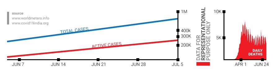
To understand this, let us assume a scenario where we have a hall which can accommodate 500 people. There are 10,000 people lined up to enter the hall. As some people enter the hall, some leave it through the exit door. Should we be scared about the total number of people who have entered or exited the hall or should we focus on the number of people inside the hall at any given point of time. Yes, the hall could get overcrowded but it will not create the same scare as the cumulative figures would, which seems to suggest that no one left the hall.
Another communication mess is the term ‘recovery rate’. I doubt if someone in the governments has even thought about what the term means. The common perception would be that the term represents number of people who recover. So if fatality is 2% then recovery rate is 98%. But that is not what they want to say. They want to tell us about recovery rate per death. You can search online and check out the confusion for yourself. It is a good testimony of how data is understood, perceived and communicated.
So is the data hacked?
Who knows? Maybe it is. Or maybe it is an outcome of our collective ignorance or laziness. The longer these questions remain unanswered, the longer will be the list of conspiracy theories. And longer shall be the collective suffering of the world!
Most data analysts as well as subject matter experts seem to follow linear thought processes. I wonder if that is the root cause of the problem. I also wonder if this disdain for systems thinking approach is deliberate because systems approach forces us to ask fundamental questions and that is something that the power centres want to collectively avoid!


